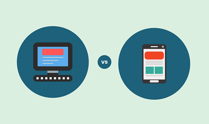
Mobile UX vs. Desktop UX: What Your Business Needs to Know
In today’s digital-first world, your website or application isn’t just a virtual storefront — it’s your brand’s first impression, your lead generator, and often your primary sales tool. But here’s the twist: how users experience your digital presence changes drastically depending on whether they’re using a mobile device or a desktop. That’s where understanding the differences between Mobile UX (User Experience) and Desktop UX becomes mission-critical.
Also Read on- Zero UI in 2025: Designing for a Screenless Future
Why UX Matters in the First Place
Before diving into mobile vs. desktop, let’s get one thing straight: UX is not just about looks. It’s about how intuitive, efficient, and enjoyable your digital product is to use. A good UX improves engagement, lowers bounce rates, increases conversions, and builds trust. A bad UX? Well, that’s often a one-way ticket to losing users.

1. Screen Size and Layout: Less Room, More Creativity
- Desktop UX benefits from larger screens, allowing more complex layouts, sidebars, and content-rich interfaces. You can afford to be a bit more detailed and data-dense.
- Mobile UX, in contrast, deals with limited real estate. Prioritization becomes key. Interfaces must be streamlined, touch-friendly, and hyper-focused on the user’s most immediate needs.
📌 Tip: For mobile, adopt a minimalist mindset. Every pixel must serve a purpose.
2. User Intent and Behavior: Different Contexts, Different Goals
- Desktop users are often at work or at home, spending more time on tasks like research, comparison shopping, or managing accounts. They’re more likely to tolerate complex navigation and multitasking.
- Mobile users, however, are typically on the go. They want quick answers — think store hours, directions, or making fast purchases. They value speed, simplicity, and convenience above all.
📌 Tip: Design for task-based use on mobile and exploration-based use on desktop.
3. Navigation Patterns: Click vs. Tap
- On desktop, users navigate with a mouse or trackpad. Hover states, dropdown menus, and fine-grained control are all in play.
- On mobile, it’s all about taps, swipes, and thumb-friendly interfaces. You can’t rely on hover effects, and small buttons become usability hazards.
📌 Tip: Use larger, well-spaced buttons and avoid complex menu structures on mobile.
4. Performance Expectations: Speed Rules Mobile
- Mobile users are often on slower connections or using data plans. They expect fast load times, minimal friction, and interfaces that work well even with one hand.
- Desktop users may tolerate slightly heavier pages, especially if the added content is valuable — but not for long.
📌 Tip: Use mobile-first performance optimization like image compression, lazy loading, and responsive design.
5. Input Methods: Keyboard vs. Touchscreen
- Desktop users have access to full keyboards, making long form-fills, content creation, and detailed searches easier.
- Mobile users rely on touchscreens and virtual keyboards. Long forms or complicated inputs can frustrate users quickly.
📌 Tip: Shorten mobile forms, use auto-fill, and offer tap-friendly alternatives (e.g., dropdowns or buttons).
6. Conversion Paths: Tailor by Device
- Desktop might be better for complex conversions — like submitting applications or completing detailed surveys.
- Mobile is ideal for quick actions: calling, navigating, ordering food, or making one-click purchases.
📌 Tip: Align your call-to-action (CTA) based on device type. “Call Now” works better on mobile; “Read More” might work better on desktop.
Responsive Design Isn’t Enough
While responsive design ensures your site adjusts to different screen sizes, it doesn’t guarantee a great UX. Mobile UX should be designed deliberately, not just derived from the desktop version.
In many cases, businesses benefit from creating adaptive experiences — custom layouts, features, or even separate designs for mobile and desktop, tailored to user behavior on each platform.
Final Thoughts: Prioritize What Matters to Your Users
UX isn’t one-size-fits-all. Your audience expects different things depending on the device they’re using. By recognizing and designing for the differences between Mobile UX and Desktop UX, your business can meet users where they are — and guide them where you want them to go.
✅ Better UX means happier users.
✅ Happier users mean more conversions.
✅ More conversions mean a stronger business.
In today’s competitive digital space, that’s not just good design — it’s good business.
Comments
Post a Comment